This is the new logo for Consulta Giovani Valsamoggia, the youth council of the small town near Bologna, Italy, where I grew up and live. It's an association of young people that organizes events on the territory of the municipality. I joined them a few years ago, and when they asked me to redesign the logo I was thrilled for the opportunity.
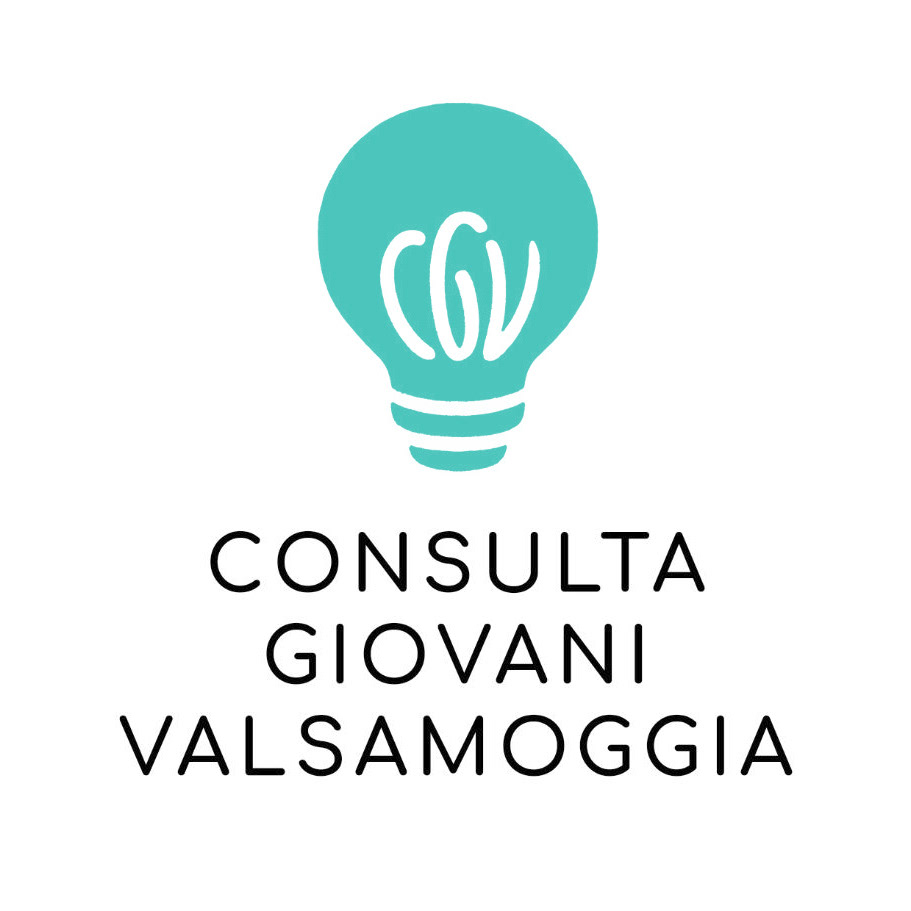
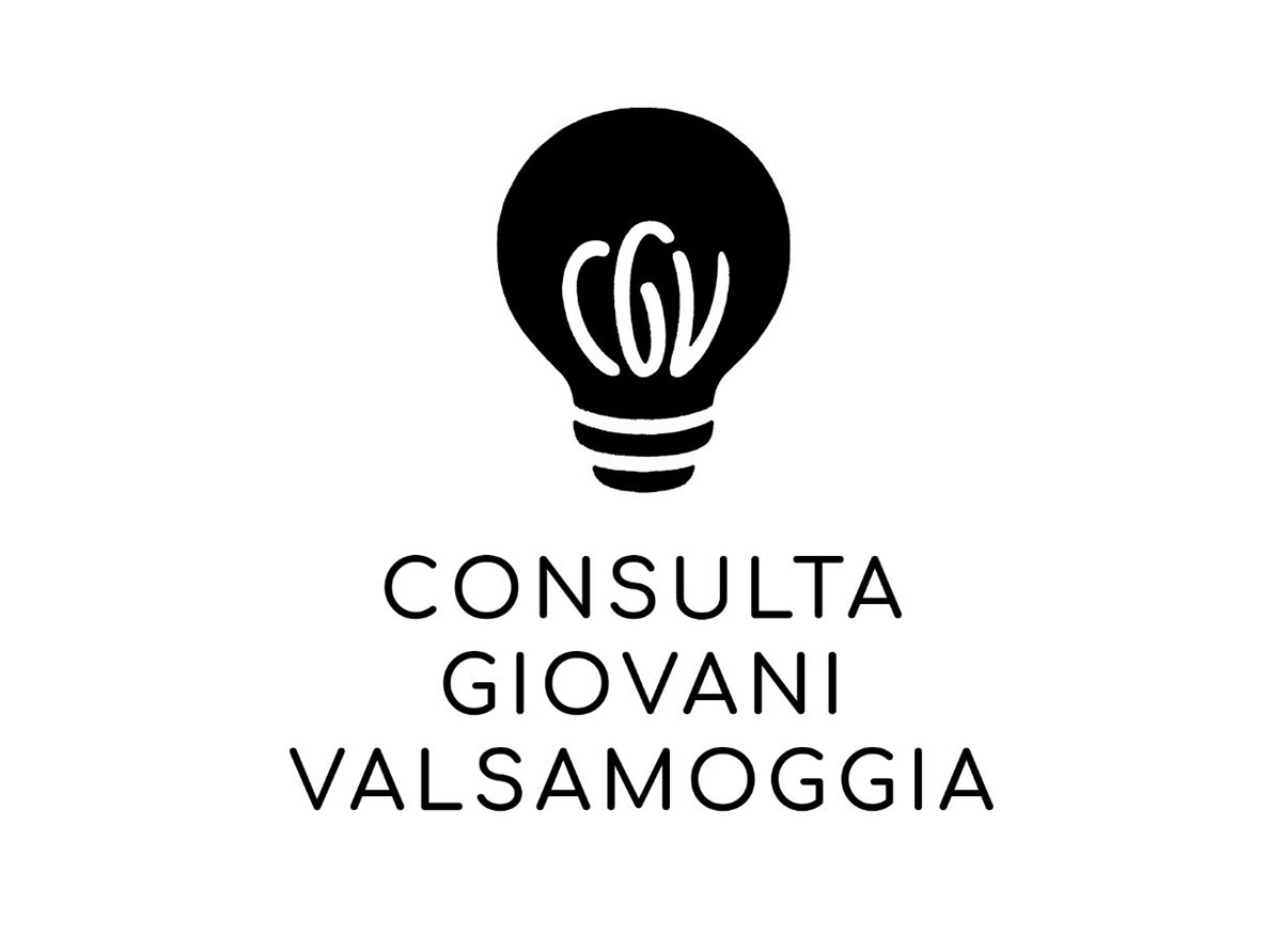
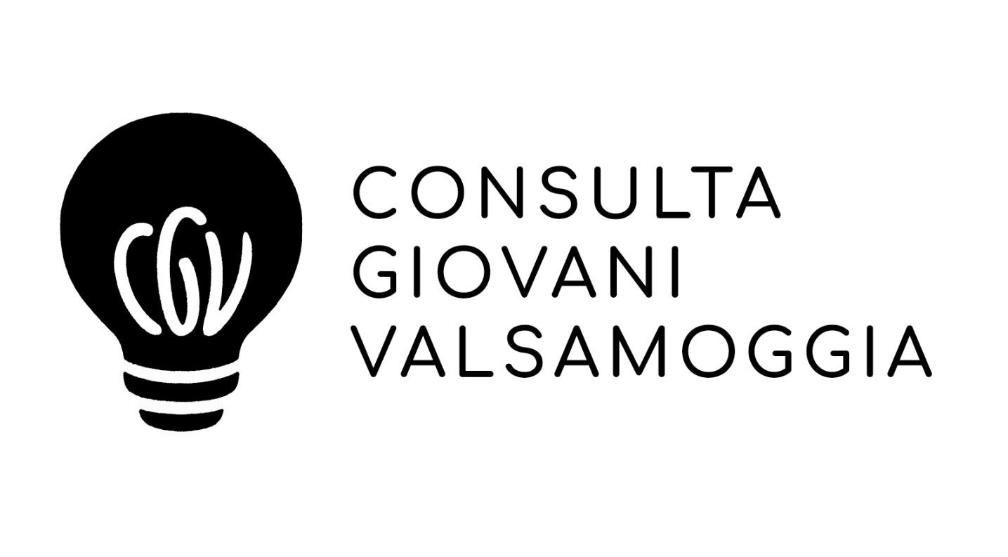
Below you can find the final design, where a C, G and V are visible in the metal wire of the light bulb. But how did I land on this version? Check out the rest of the project to see a bit of the process!
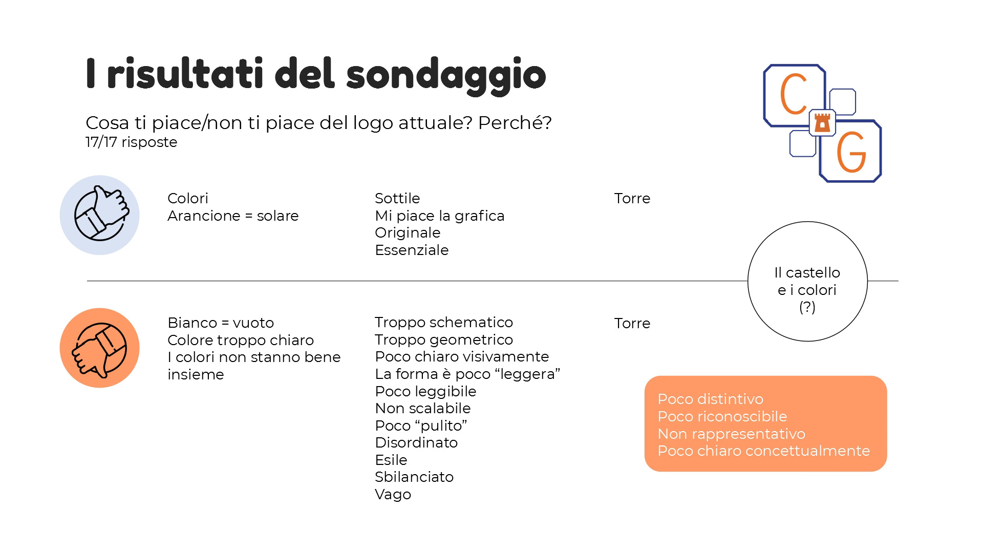
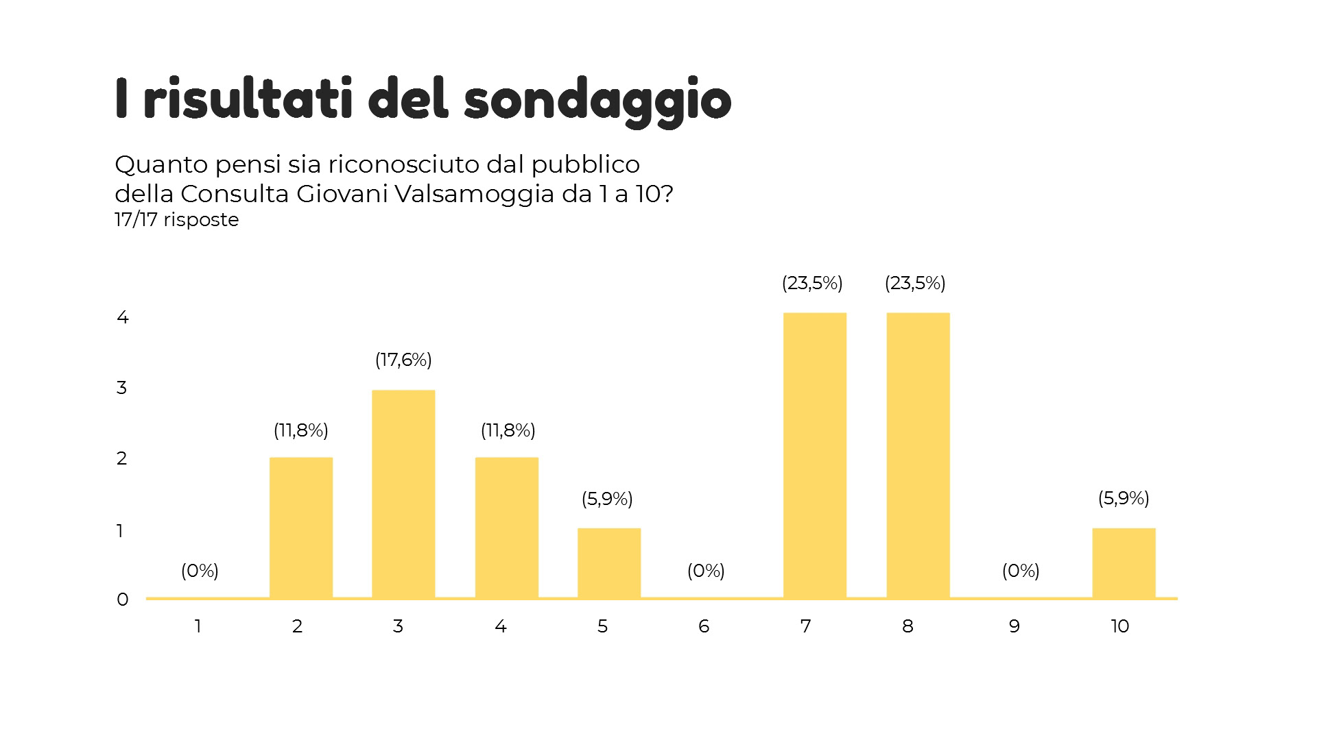
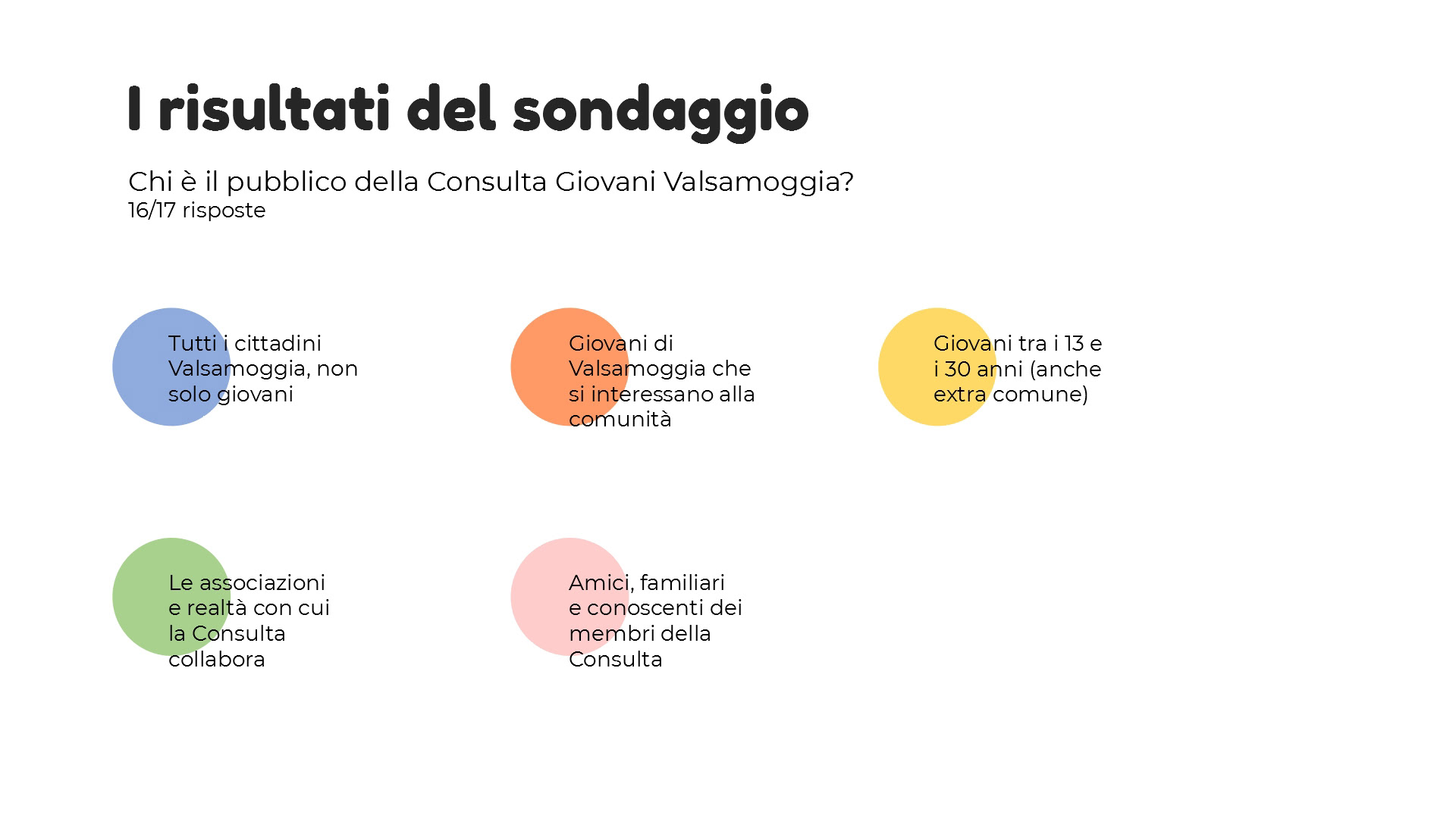
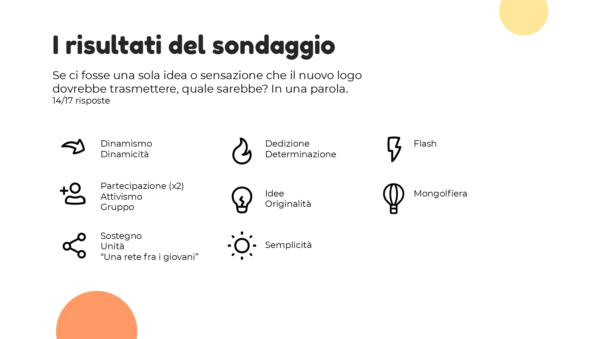
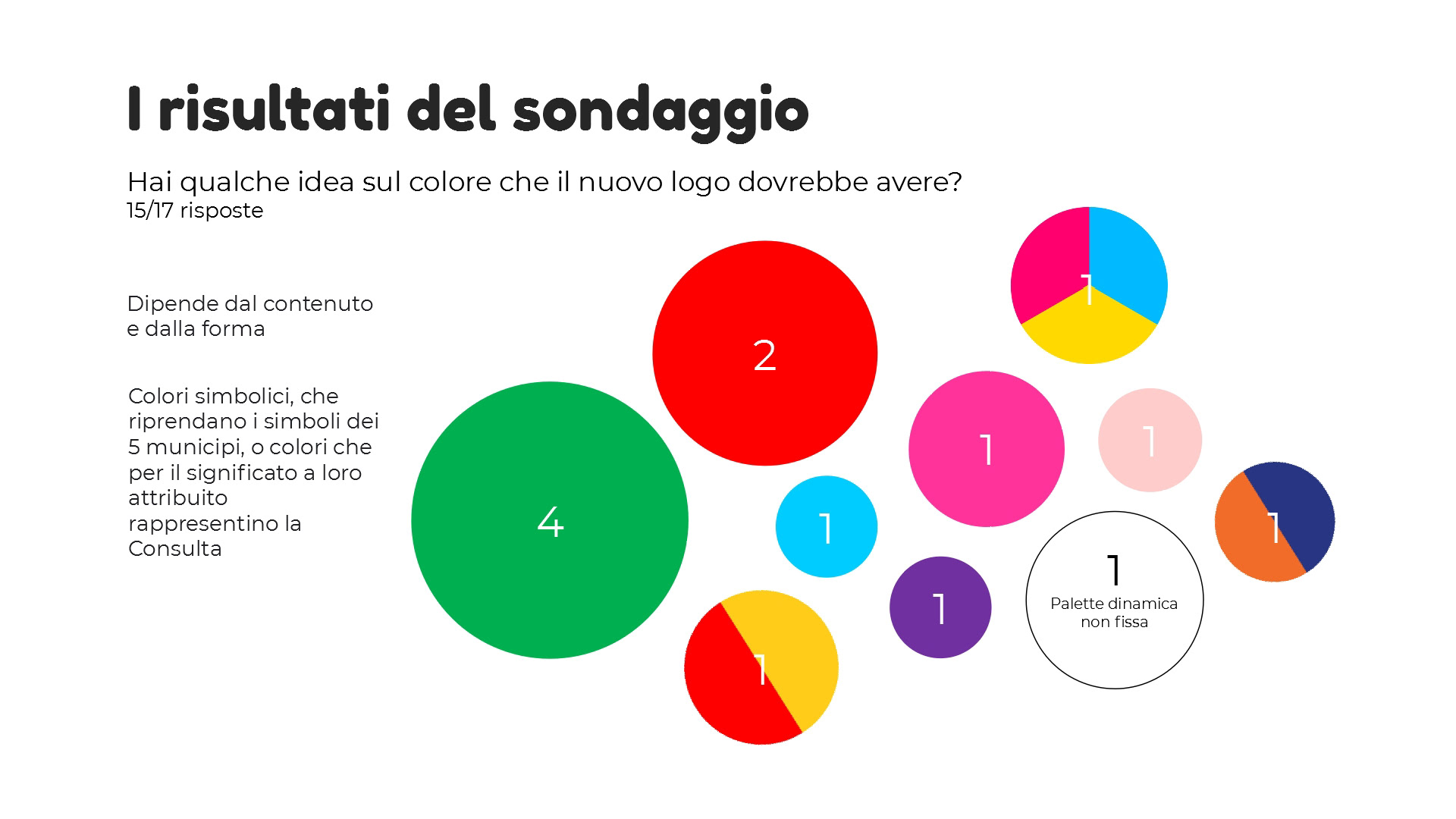
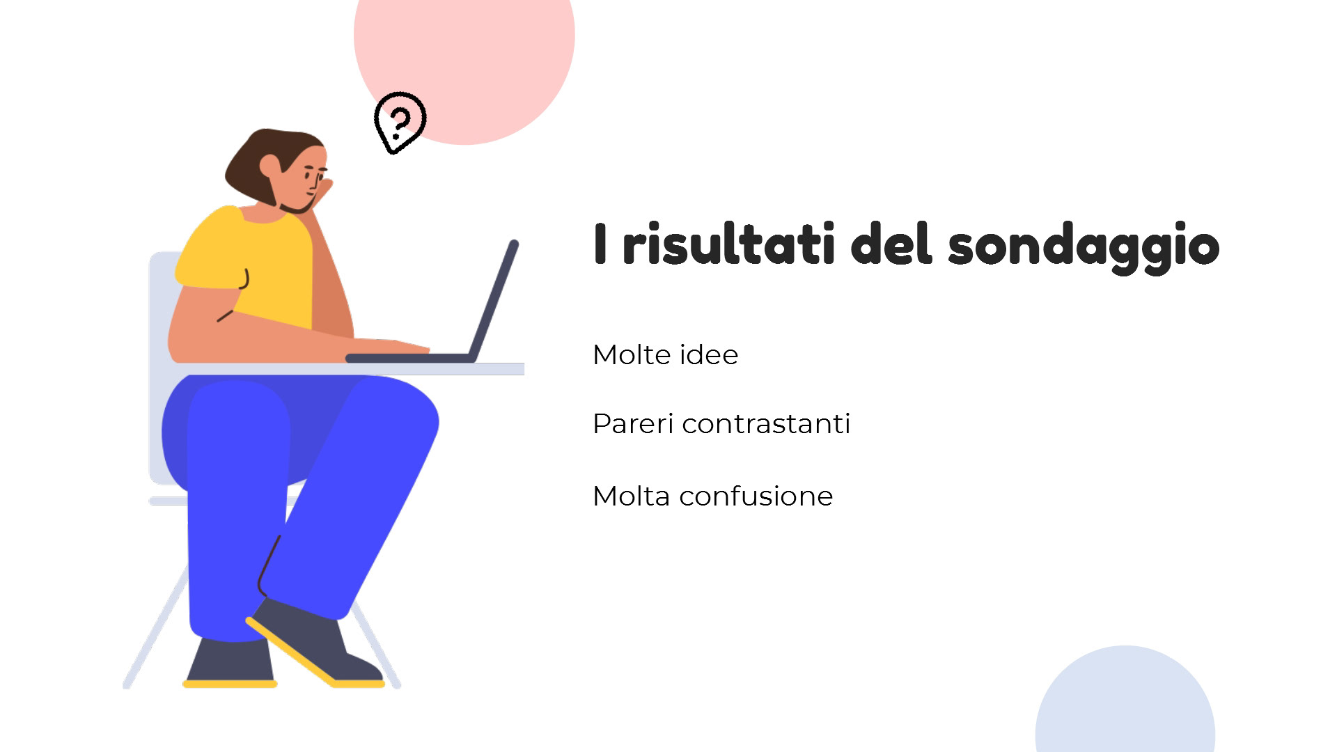
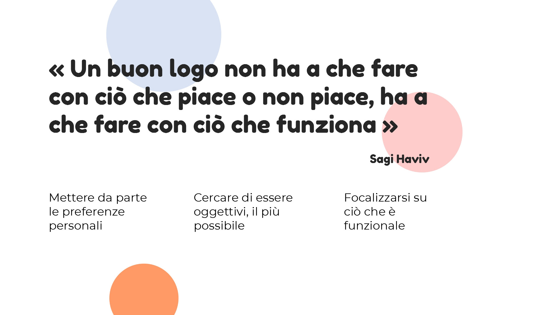
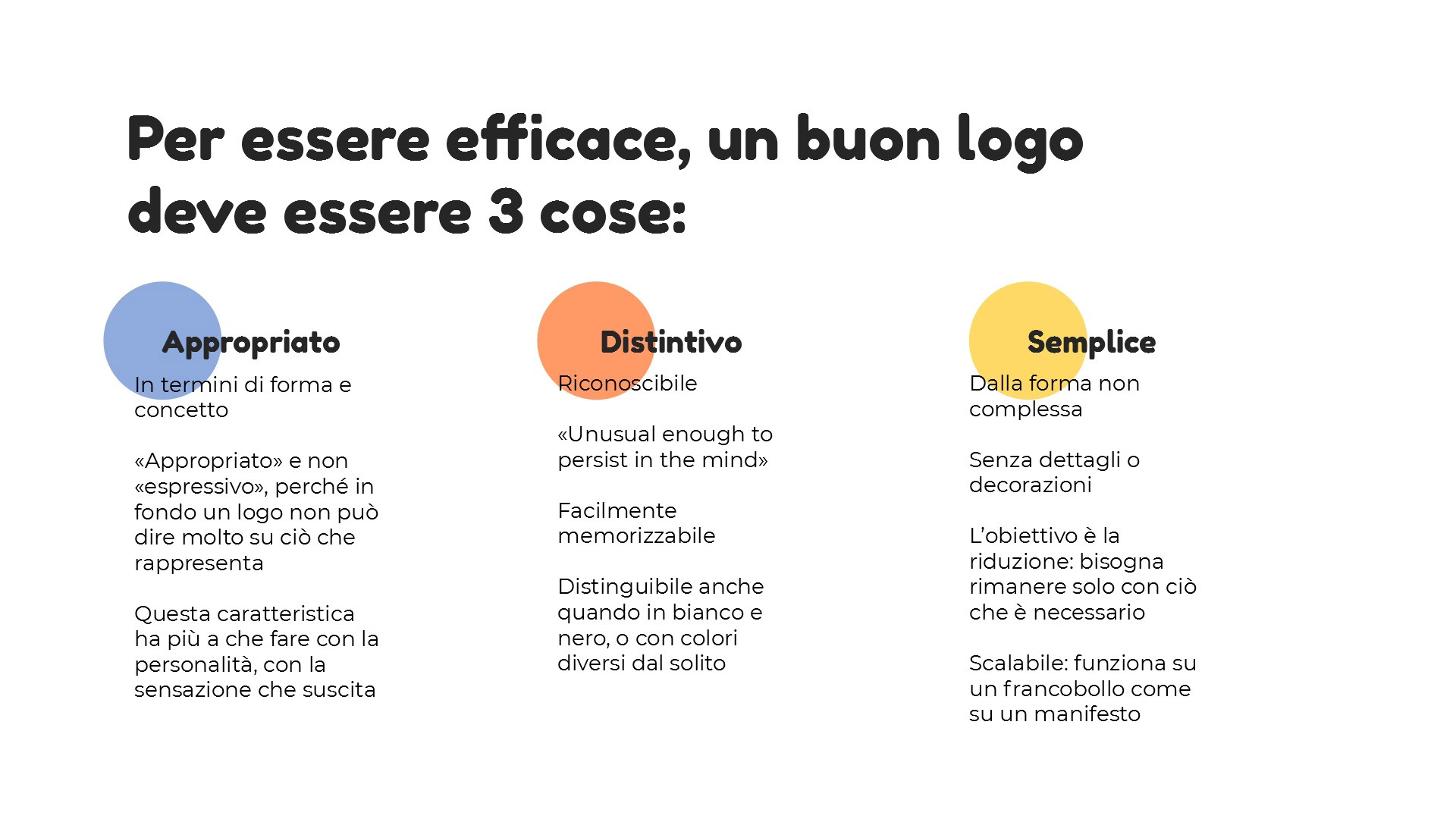
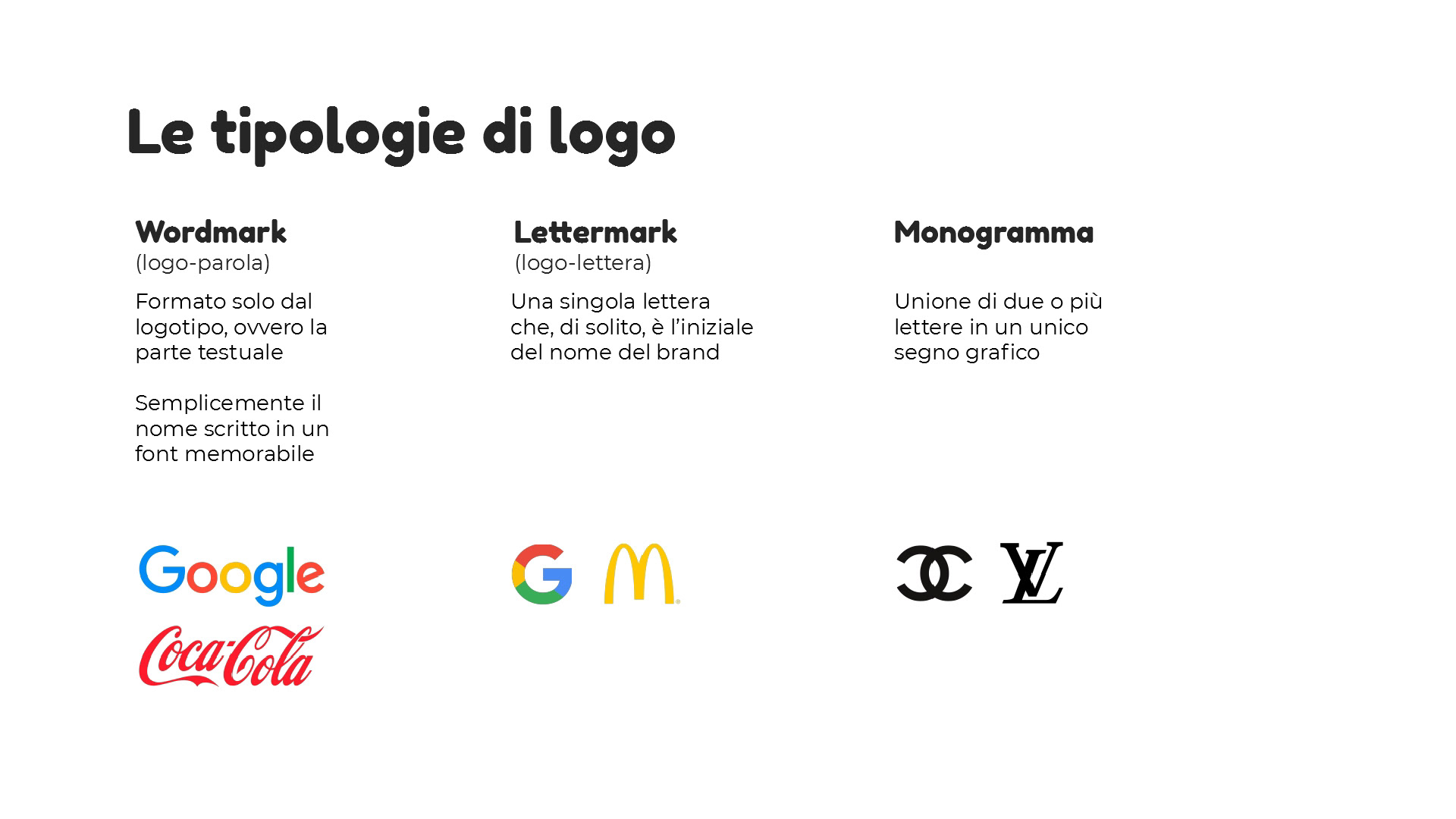
First, I sent an online survey to the council members, then I examined the answers to have a better understanding of the needs and ideas for the new logo. Then I made a presentation showing the results of the poll, a bit of logo design theory and some possible approaches. After the youth council meeting, I finally had a clear direction to take.


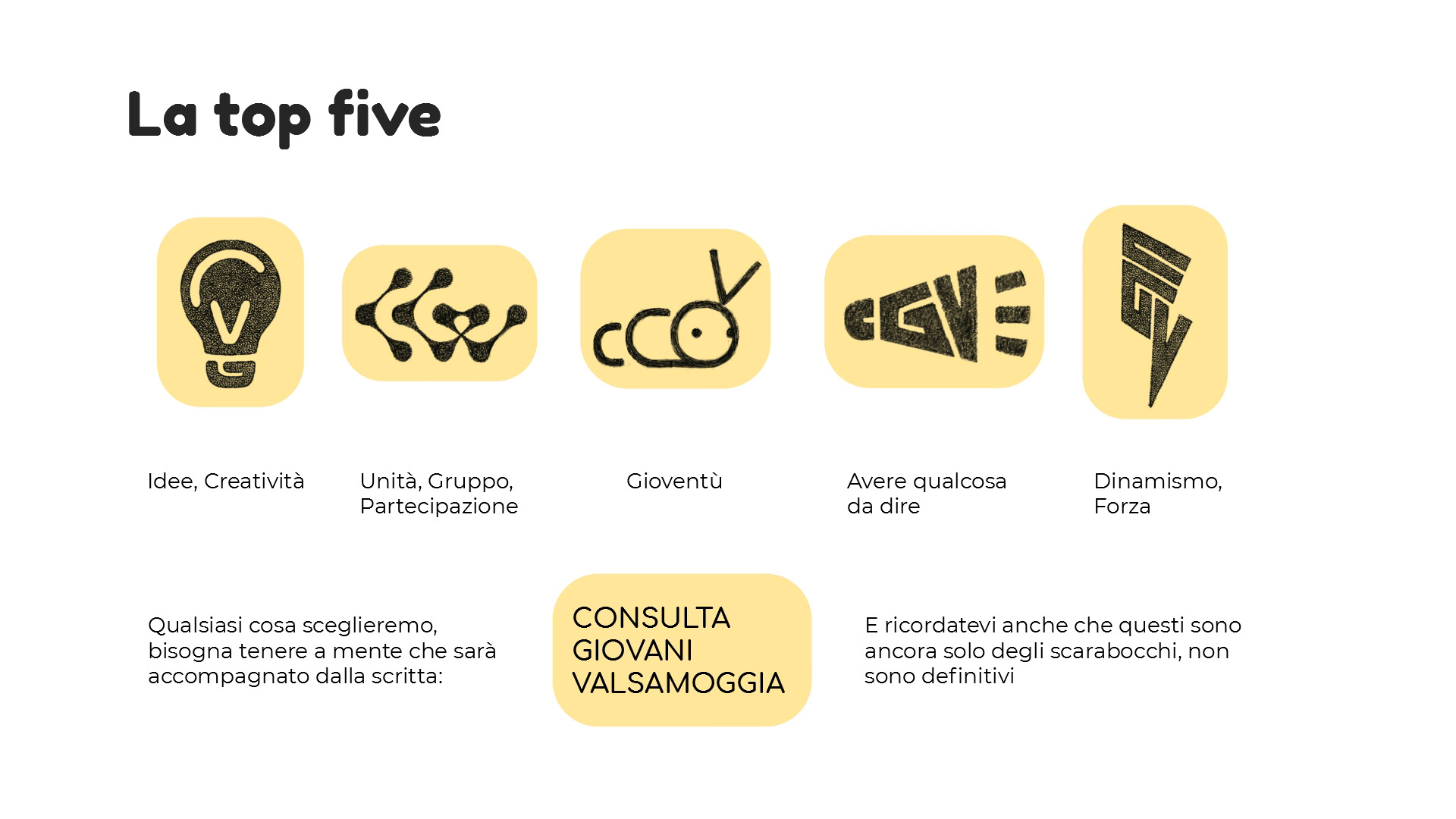

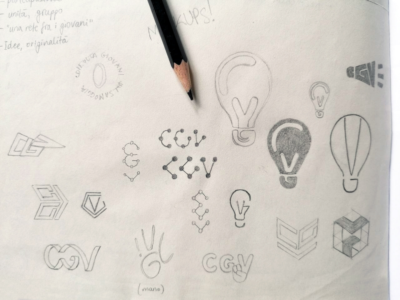
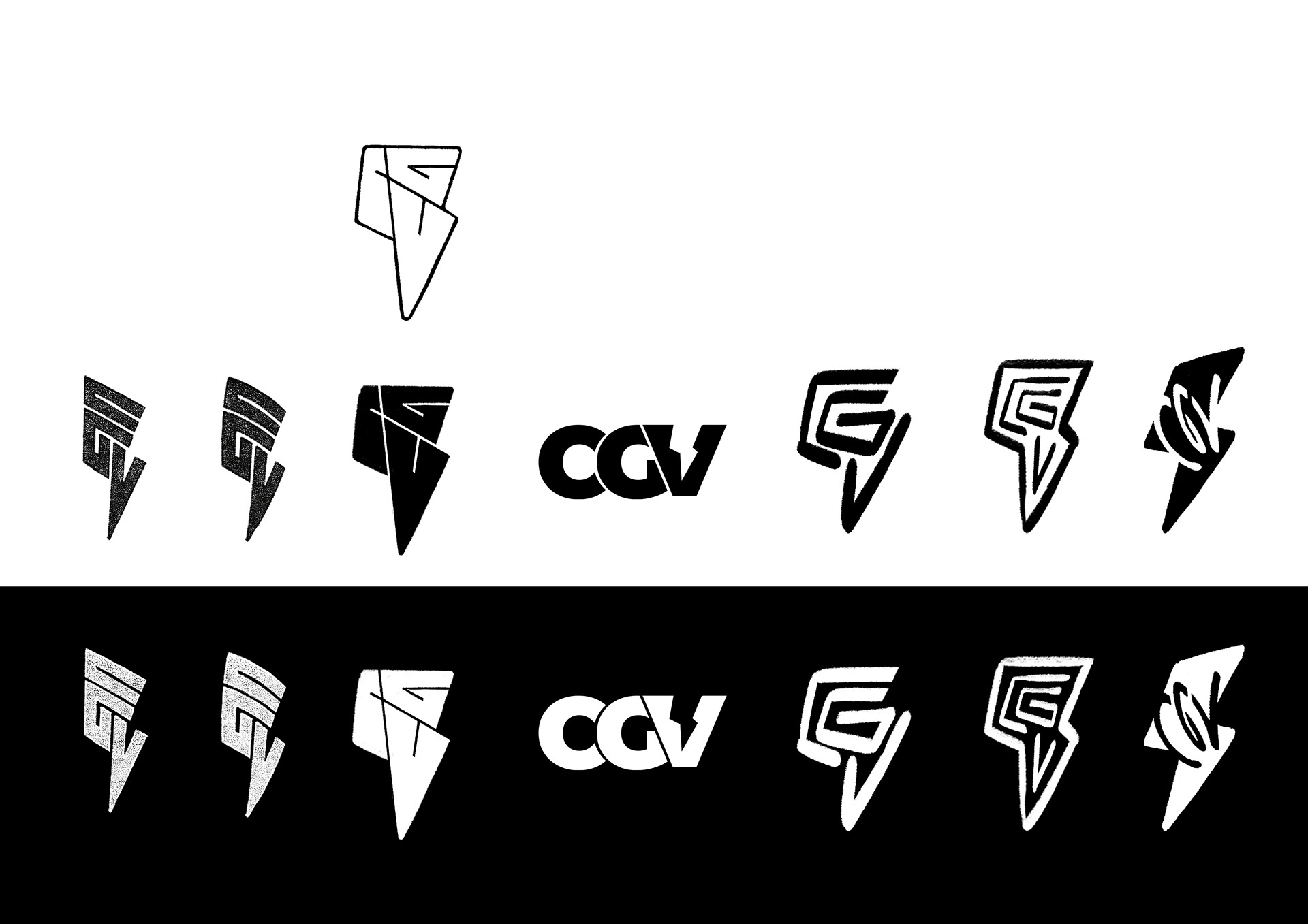
After that, I continued doodling on the ideas discussed in the meeting, finding slightly different proposals for the shapes of the light bulb and the lightning bolt, and put them both black-on-white and white-on-black to have the negative version as well.
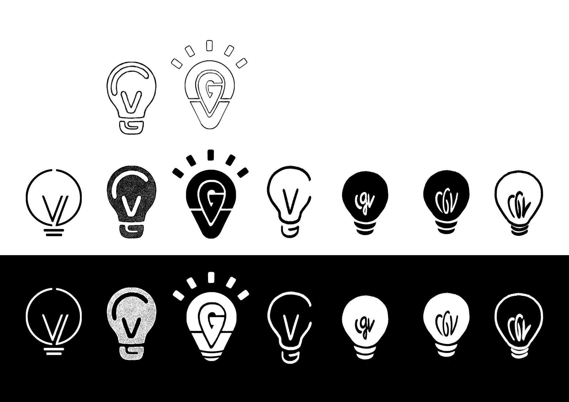
After pitching these ideas to the council, we decided to go for one of the light bulbs, so I developed it further and finally made the definitive version:
Then it was only a matter of colour: I presented a variety of options, but suggested a bright turquoise to give the logo freshness and character, and they welcomed it.
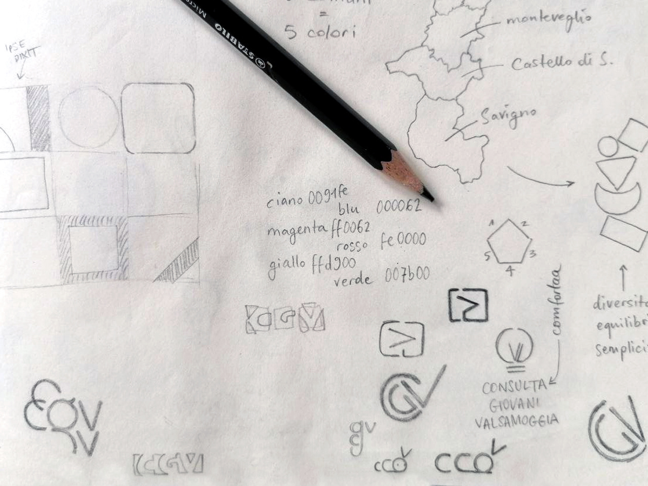
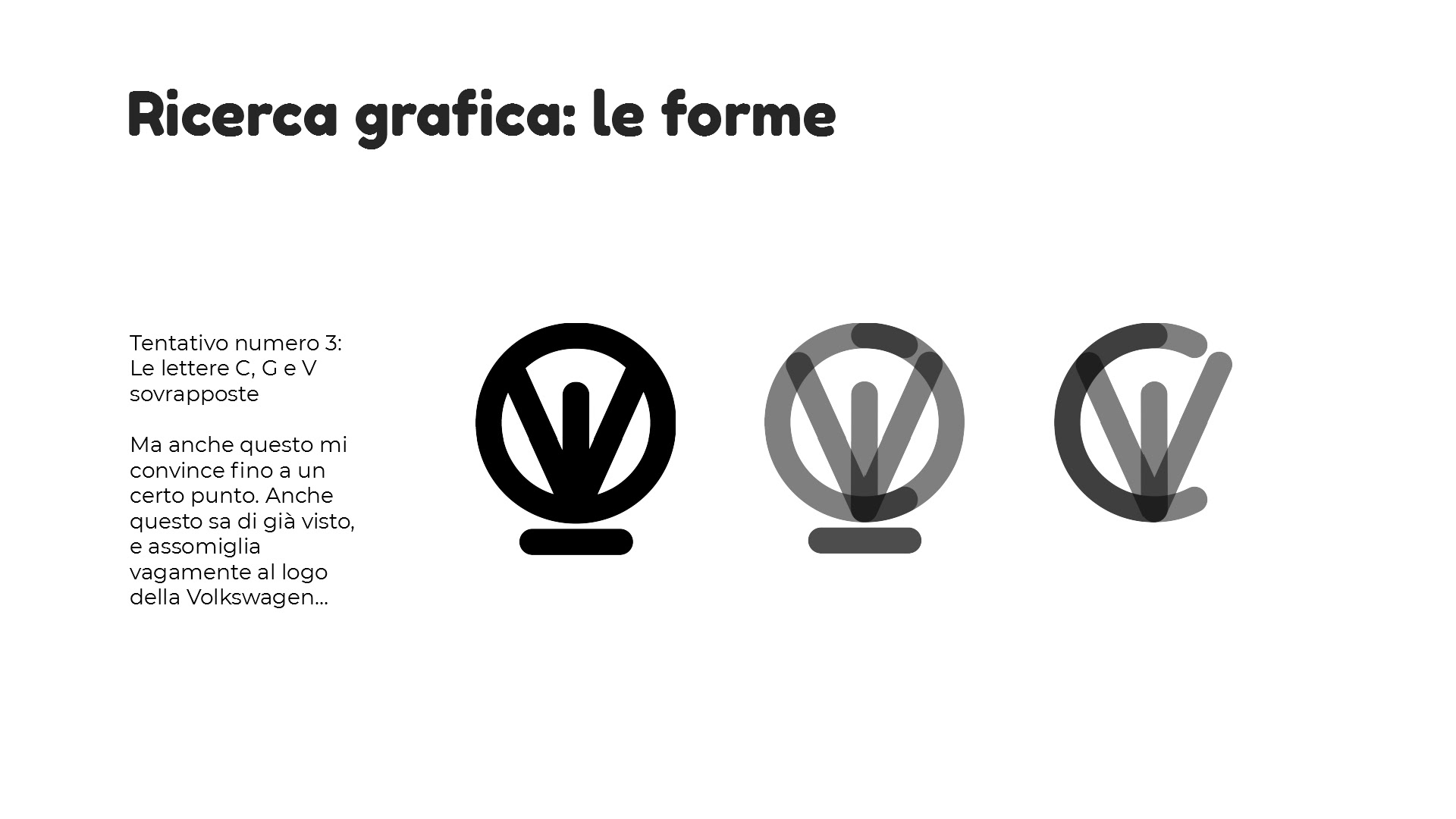
Below, some ugly pictures of the first ugly attempts... it's always a matter of trial and error :)